


Uvallanne is an OpenType font, that has plain and italic faces. Both of them contain over two thousand glyphs, e.g. Latin alphabets including additional characters, ordinary phonetic characters, modern Greek alphabets, Cyrillic alphabets with additional characters and a lot of special signs. There are many fonts, that have at least as broad character set. But apparently Uvallanne is the only one, which aims to fully support the Uralic Phonetic Alphabet (UPA).
Uvallanne is based on base letters and diacritics of JL-types' Fluralic created in 1991. The University of Tokyo ordered on the basis of Fluralic in 2004-2005 an OpeType font JLOT-Fluralic, which is based on the Unicode standard and on which were added several new characters and OpenType features, that support automatic rendering of the diacritics. Uvallanne is a continuation development of JLOT-Fluralic.
The main feature of Uvallanne is the full support of all characters and diacritics of the Uralic Phonetic Alphabet and typographic rules, that guarantees that all diacritics will be rendered nicely by the base letters and each other.


This automatic rendering of phonetic diacritics works only on applications, that are capable to interpret typographical OpeType rules build into Uvallanne. OpenType aware applications are by now Adobe's InDesign (and other CS applications), Redler's Mellel (on Mac OS X). Also a special Windows application Classical Text Editor (CTE) handles perfectly advanced typographical features of Uvallanne and other OpenType fonts. Unfortunately any other application can't take advance of special features of Uvallanne. Adobe and Microsoft established the OpenType format already in 1996, but still in 2009 not a single Microsoft's application supports advanced typographical features of OpenType fonts! There has been promised for better OpenType support in Microsoft Office 2010, but we'll see, whether this is true and how well the support works.
Every users of InDesign, Mellel, and Classical Text Editor can obtain Uvallanne free. It is useful only for users of these programs. When hopefully there will be new applications, that support properly OpenType features, then the font will be available for users of those programs.
Uvallanne offers an opportunity to write complicated phonetic texts easily, but the aim is not to encourage you to write on too complicated ways.
Often it is possible and wise to use phonemic or simplified orthography. But when simplifying ortography, please do it properly.
The sophisticated support of the Uralic Phonetic Alphabet on Uvallanne is based on several variants of necessary diacritics and on rules, that can pick a proper variant on different contexts. In the font base letters and diacritics are grouped to classes, that behave typographically certain way. For example i and r belong to the class of narrow base letters, n and o are normal, m and w are wide, and f and d are high. There are tens of classes in the font. The rules can have impact even after five characters. The rules have usually a strict order.
Technically speaking in Uvallanne there are according OpenType specifications chaining contextual substitution rules. Applications show these rules as ligature rules. As a matter of fact these are complicated rules, which pick a proper glyphs on different contexts. Ligatures are basically similar picked the same way.
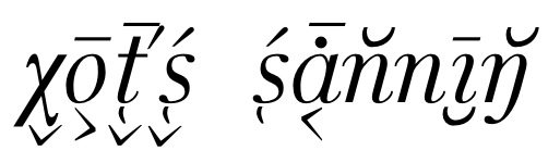
In the picture you can see by the letter t four different diacritics. These are written after the base letter t so: Unicode 031C (hook marking coronal articulation), 032C (arrow down marking laxness), 0301 (acute marking palatal acticulation), and 0304 (macron marking length). OpenType aware applications are able to pick the variant "uni031C.alt01te" for 031C, then the variant "uni032C.alt07te" for 032C. After that they know, that for 0301 must the variant "uni0301.alt12" be used and then the variant "uni0304.alt03" for 0304. Every variant carries information about itself and about the base letter. The rules can have also retrospective direction: dots above i and j will disappear, if they are followed by diacritics, that does not look good with i and j with a dot. The second word in the picture shows an i without, which were written as a normal i letter.
A proper rendering of diacritics works only, if applications can interpret all these rules and in the proper order. Only few here mentioned applications can do it. Some applications, like Quark XPress can interpret the first rule. Sometimes it is enough, but on all complicated cases diacritics are not in decently positioned.
The goal on creating Uvallanne was to provide enough glyph variants and combination rules so, that a complicated phonetic notation is reasonable good looking. This in not completely possible in every case, because this would require more variants and rules than could be made by so far. You can see on text proves, that sometimes a diacritic hits on the leg of j and and a bowl diacritic below the base letter is not always in exactly the best position. It is nearly impossible technically to render all these cases.
In Finnish pages there is more information about Uvallanne. It is likely, that most or every person interested on the Uralic Phonetic Alphabet is at least a little bit familiar with Finnish. Please ask for more information (or help us to translate the rest pages to English).